Capturing the best Instagram image to boost your like count
With roughly one billion monthly active users, Instagram is the pinnacle for getting your stunning snaps out to a global audience. The goal is to publish an Instagram image that both the algorithm and followers love. The challenge is coming up with the right mix of inspiration and creativity to meet that goal. When you hit this sweet spot your followers will be clamoring to smash that like button.
Whether you’re a foodie who enjoys sharing a mouth-watering dinner photo from that latest hole-in-the-wall hidden gem, or you’re helping tell a brand story online, there’s a science behind how users will interact with your post. In a recent study, Researcher and Assistant Professor of Marketing for Saunders College of Business, Gijs Overgoor, examined 150,000 Instagram posts to discover how to select an Instagram image that will get the most likes.
Overgoor recently spoke with Business Insider to share some of his primary findings. According to the article, the study examined Instagram images posted by more than 600 brands, which were sourced from the Gartner Digital IQ Index, a ranking of the highest-performing retail brands in the world.
Here are some of the key findings from the research:
What Instagram image captures all of the likes?
There were two primary categories Gijs used to classify the impact these images had on the audience:
1. Feature complexity of an Instagram image
Feature complexity can be described as the variation between pixels in an image, and it includes the colors in a picture, its brightness, and its detail density. For example, a colorful and highly saturated image has more feature complexity.
2. Design complexity of an Instagram image
According to the article, design complexity refers to the elements of an image and how they are arranged within the frame. An image will have a high rate of design complexity if it has many objects arranged randomly and less design complexity if it has only a few objects arranged symmetrically.
Example: Instagram image with more design complexity
Example: Instagram image with less design complexity
Ultimately the study concluded that in order to hit that sweet spot of engagement, an image should have a medium degree of feature complexity and should sit on either end of the design complexity spectrum. Following these guidelines can increase frequency by up to 19 percent.
"If an image is too complicated and we need too much energy to process it, that doesn't work, but it can't be too simple, because we need to be stimulated enough to engage with it," Overgoor shares with Insider.
Overgoor goes on to say that it also depends on what advice your audience is viewing content on.
"If you scroll on a big screen, you can handle a little more complexity. Maybe if you're on the subway ride home from work after a long day, your threshold for complexity is a little bit lower."
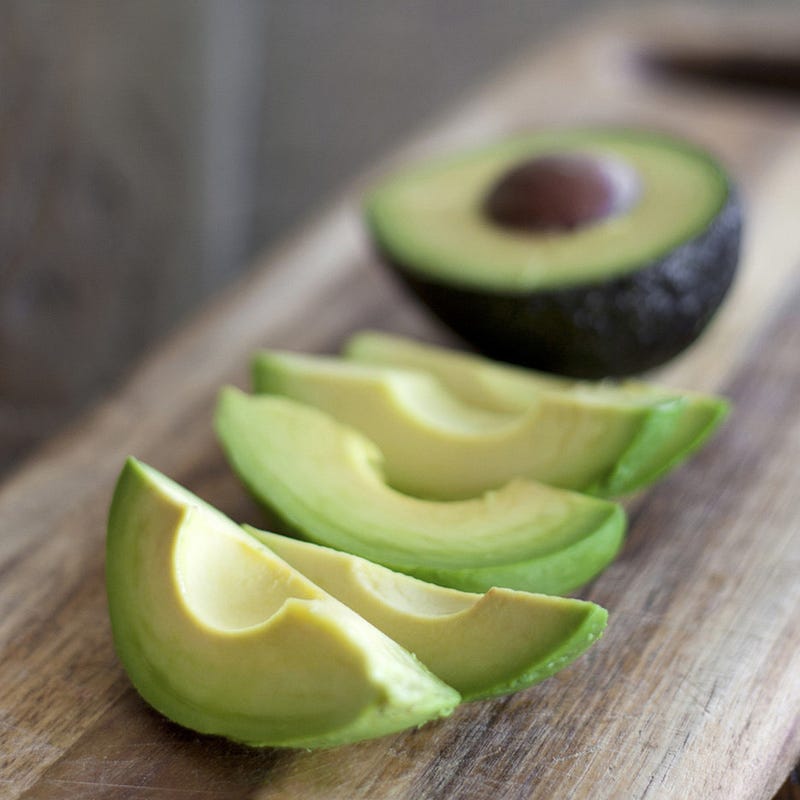
This picture of a sliced avocado exemplifies an optimal balance of feature and design complexity, with the right amount of color, brightness, and detail.

Credit: Gijs Overgoor | Source
Top tips for creating the best Instagram image
With the research in mind, there are a few other ways you can up your Instagram image game with these top tips:
1. Lighting is everything
When taking a photo for Instagram you want to ensure the lighting is working in your favor. Avoid artificial light as this can make subject matter look dull, flat and discolored. Opt for an outdoor shoot or if the weather won’t cooperate, set yourself up near a window with lots of natural light streaming in.
You can also take advantage of “golden hour”, the one hour before the sun dips below the sunset for the evening. The soft, warm glow of the setting sun always paints a subject in the most flattering light possible.
Finally, be sure to watch out for backlighting and over exposure. If you have a natural light source, like a window positioned in your frame, be sure to focus your camera or mobile device on the subject. This will correct for any possible light blow out which will prevent image details from coming through.
2. Lean on an expert
If you’re not confident in your ability to pull off the perfect shot, Social Media Strategist and Founder of Collective Marketing, Nicola Doherty, recommends making the investment in a professional photographer.
“You can use those photos for everything from blogs, Instagram, your website, anything,” Nicola says.
“If you can’t hire a photographer, use your phone, but do a couple of things. Firstly, clean your lense. The phone lenses get quite dirty and will leave a glare on your photos. Secondly, enable the grid feature on your camera so you can line up the shot and make sure it’s straight.”
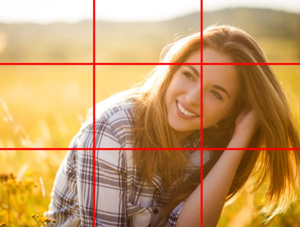
3. Rule of thirds
This could be the oldest trick in the book to help improve the composition of your Instagram image. The rule of thirds is a principle that uses a 3x3 grid. When placed over an image, through settings in your camera device, or just imagined as lining up your shot, the lines will guide your positioning of points of interest in the frame. You want to place your subject where the grid lines intersect. The horizontal lines work well for lining up the horizon in a landscape image and the vertical lines work well for positioning a person, product or animal within a frame.

4. Take a different perspective
Great images often come from either taking a step back or zeroing in on your subject of focus. The image below is a great example of the potential an image can have when a photographer steps back from their subject matter to include more of the setting. In this image part of its beauty is the seeing the awaiting guests and beautiful design work on the ceiling.
The example above is also a great example of the rule of thirds principle really drawing the eye in, to focus on the bride.
Conversely getting up close and personal with the object you’re capturing can have stunning results. Detailed up-close images will often magnify the natural beauty of a pattern, color or design.
Recommended Reading: 39 Ideas When You Don’t Know What to Post on Social Media
5. Never forget a face
Georgia Institute of Technology and Yahoo Labs researchers looked at 1.1 million photos on Instagram and found that pictures with human faces are 38 percent more likely to receive likes than photos with no faces. They’re also 32 percent more likely to attract comments.
Photos with faces perform well, because we can more easily connect with a subject we can easily identify with. Don’t shy away from using a friendly face in your next Instagram post.
“In terms of the best type of content, images with people always do well,” Doherty agrees. “But so do images that give a behind-the-scenes perspective on the day-to-day operations of a brand.”
Doherty adds it’s a good idea to offer variety to your audience in order to keep engagement rolling in.
Final Thoughts
Paying attention to the color, complexity, and composition of an Instagram image can help you, or a client you represent to better tell a brand story online. Putting some thought and intention behind each post before snapping that image will help you increase Instagram engagement and also represent the account in the best light possible. If you’re looking for ways to better plan and execute your next social media post ideas, learn more about Vendasta’s social marketing solutions here.
[adrotate banner= 166]

