In the world of web design, discussions of the visual aspect of creating websites seem to take up a lot of air. However, before jumping into the aesthetic direction of a new website project, it’s important to understand what purpose it’s meant to serve, and how this should inform the design.
The approach required to build a non-ecommerce website differs from what’s needed to create websites with ecommerce. The goals of each type of website are distinct, and this shapes web design decisions. In this article, we’ll untangle the unique aspects of both ecommerce and non-ecommerce websites, helping you create more usable, memorable website projects.
Difference between non-ecommerce and ecommerce website design
Websites with ecommerce and those without both have some desired goal or action in mind for the visitor, but these goals differ. These distinctions lead to considerable differences in how each type of website and their respective web pages should be designed. Let’s dig into the most significant differences between ecommerce and non-ecommerce websites.
Product pages and shopping cart design
For ecommerce websites, product pages and shopping cart design are of central importance. The goal of other pages on the website is generally to nudge visitors toward product pages, so that they can take the desired action: make a purchase.
To that end, product pages should be visually appealing and informative, providing visitors with essential details to inform their buying decision such as price, features, and product specs. High-quality images, engaging descriptions, and easy-to-access customer reviews help facilitate purchasing decisions.
The shopping cart, on the other hand, should provide a smooth user experience, making checkout an effortless process.
On ecommerce websites, these are two of the most important design aspects, requiring the most thought and effort—especially when pitching to clients. On non-ecommerce websites, they don’t even exist, indicating just how different design strategies for these two kinds of sites can be.
Conversion optimization
When a visitor lands on an ecommerce website, there is one action that every business wants them to take: they want them to check out, or convert. We’ve talked about the central importance of product pages and shopping cart design in helping to drive users toward this action, but on ecommerce sites, the whole rest of the site is also optimized to encourage more conversions.
Conversion optimization considerations for ecommerce websites include:
- Regular A/B testing to improve conversion rate with iterative improvements over time
- Fast page load speeds to reduce website bounce rates
- Optimized, easy-to-complete forms
- Simplified navigation that makes it easy for customers to find what they’re looking for quickly
The role of branding
While branding is indispensable for all businesses, whether they have an ecommerce component or not, it plays an especially unique role in non-ecommerce website design. Ecommerce websites can differentiate themselves through their product offering, while non-ecommerce sites often need to lean more heavily on a strong brand for differentiation.
Non-ecommerce sites can rely on branding to stand out in a crowded marketplace, convey trust, credibility, and expertise to customers, make their businesses more instantly recognizable, and drive emotional connections with audiences.
Content creation
Quality, informative content is especially critical for non-ecommerce sites because it’s typically the main driver of traffic, ultimately contributing to more conversions. Let’s take a look at some non-ecommerce website examples to see how this works.
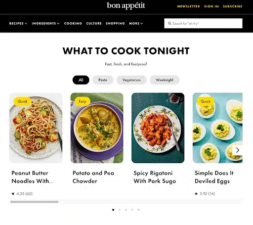
Consider the example of popular online food publication Bon Appétit. There is no shortage of food blogs out there, but Bon Appétit manages to stand out and differentiate itself with compelling, easy-to-follow content (in this case, recipes), that visitors can conveniently find in a few clicks. Coupled with high-quality images, the content on Bon Appétit helps to distinguish its brand from the more conversational, DIY content created by other popular food blogs.

Source
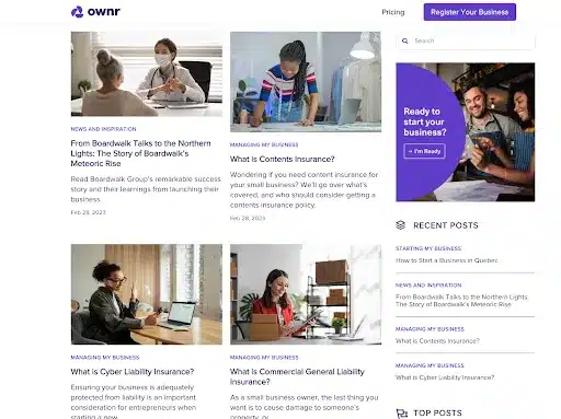
Another non-ecommerce website example is Ownr, which offers business registration and incorporation services. Since this is an area in which new business owners have many questions, it makes sense to create regular blog content to drive traffic and interest in their service.

Source
For non-ecommerce businesses, content is often the main driver of interest and traffic, making it a vital lynchpin of non-ecommerce web design.
Design considerations for non-ecommerce websites
Since ecommerce sites seem to get most of the attention when it comes to web design, it can be easy to assume that website builders are meant to be used primarily to build sites selling products. However, most can also be used as non-ecommerce website builders.
For example, Website Pro is a completely flexible and customizable drag and drop non-ecommerce website builder that can be used to create on-brand WordPress sites for your creative agency clients. If they ever do want to add ecommerce functionality, WooCommerce can be added in a few clicks.
So, what web design tips should you be aware for those non-ecommerce projects? Here are our favorites.
1. Clean and simple design
Non-ecommerce websites need to communicate their message clearly and effectively to maintain audience interest. With no products to sell directly, these websites need to ensure that visitors can seamlessly navigate through the content and find the information they’re seeking.
To achieve a clean and simple design, consider the following principles:
- Limit the use of colors. Stick to a cohesive color palette that aligns with your brand identity rather than incorporating different colors indiscriminately. Using too many colors can overwhelm visitors and make the website look cluttered.
- Use white space strategically. White space, the term for the empty areas between design elements, helps to create a sense of balance and improve readability. It also draws users’ eyes to the most important content.
- Choose fonts wisely. Select a legible, simple font for body text, and ensure there’s sufficient contrast between the text and background colors. Headings and subheadings should also be easily distinguishable for a clean design.
- Create a logical content hierarchy. Break down content into easily digestible sections, and use clear headings and subheadings to guide users through all parts of the website.
2. Accessibility considerations
Being mindful of accessibility ensures that all users, including those with disabilities, can access and interact with a website’s content. To make your non-ecommerce client websites more accessible, follow these tips:
- Always include image alt text. Alt text is a description of an image that can be read by screen readers, helping visually impaired users (and search engine crawlers) understand content.
- Use descriptive link text. Avoid text like “click here,” and instead provide a brief description of the destination each hyperlink points to.
- Implement keyboard accessibility. Some users navigate websites using only their keyboard. Make sure all interactive elements can be accessed and operated without the need for a mouse.
- Follow the Web Content Accessibility Guidelines (WCAG). These guidelines provide an internationally recognized framework for creating accessible web content, and help website developers avoid any costly web accessibility lawsuits.
3. Effective use of calls-to-action (CTAs)
Non-ecommerce websites may not be selling products, but they still have goals and objectives. These might be to encourage users to sign up for a newsletter, download an e-book, or book a consultation for a service-based business.
Effective web design, particularly when it comes to CTAs, can guide users toward the desired action. Use these CTA best practices to incentivize more conversions:
- Use action-oriented language. While staying on brand, opt for words that convey a sense of urgency, such as “Download Now” or “Save your reservation spot”.
- Make CTAs visually distinctive. No matter the design style, the CTAs of your non-ecommerce websites should pop. You can achieve this by using contrasting colors, bold typography, and ample white space around the CTA button or phrase.
- Place CTAs strategically. Position your CTAs in prominent locations, like above the fold on the homepage, at the end of all blog posts, and in the website’s header or footer. Experiment with different placements, and don’t necessarily limit yourself to just one CTA per page.
- Test and optimize. You might be surprised at just how much little changes to CTAs can impact conversions. The best way to discover the optimal CTA designs, copy, and placements for your projects is to tweak and test them continually.
Design considerations for websites with ecommerce
Ecommerce website design is all about driving sales. While the above design tips still apply, the primary focus should be on product pages, shopping cart design, payment gateways, and security.
1. Product pages design
Product pages are critical because it has the power to tip hesitant buyers toward making a purchase. They should be visually appealing, informative, on-brand, and user-friendly.
Images are key to successful product pages: 75 percent of customers look at product images first when deciding whether to buy a product, so professional photography is well worth the investment (Innovature BPO). Product pages should also incorporate:
- Engaging descriptions
- Easy-to-access customer reviews
- Clear pricing
- Product features and specs
- Customization options, if applicable
2. Shopping cart design
Abandoned cart rates hover around 70 percent (Baymard Institute). The impact of converting just a few percent of those abandoned carts could make a huge impact to your SMB clients’ bottom lines. That’s why the humble shopping cart deserves serious attention when it comes to web design. Shopping carts should offer:
- A frictionless user experience, enabling them to check out with minimal effort
- Intuitive navigation
- A clear breakdown of product prices, taxes, shipping costs, and any other fees
- The ability to edit product quantities and remove items
- No distractions that can take the user away from completing their checkout process
3. Payment gateway integration
Ecommerce websites need the ability to process payments safely and securely. Choose a reputable and reliable payment gateway provider that supports multiple payment methods, including credit cards, debit cards, and digital wallets. Make sure the integration works properly by testing it with different payment methods. Adding a PayPal integrations is also a good idea.
4. Security considerations
Failing to take security considerations into account when building websites with ecommerce is a major risk: data branches can be costly, both financial and in terms of your client’s reputation.
These can largely be avoided by picking a reputable payment gateway, as discussed, and implementing secure socket layer (SSL) certificates on all websites that collect any kind of user data.
In addition to using SSL certificates, plugins and other software should regularly be updated, since out-of-date plugins can create security vulnerabilities that can be exploited by bad actors.
Design considerations for both types of websites
Whether you’re using WordPress for ecommerce websites or working on non-ecommerce projects, these design considerations are valuable across the board.
1. Understanding the purpose of the website
As web designer Jeffrey Zeldman put it,
“Content precedes design. Design in the absence of content is not design, it’s decoration.”
In other words, the purpose of the website should always inform the design process. Define the primary goals and objectives, whether that’s driving sales, generating leads, or educating users. The clarity gained by defining goals will ensure the website serves its intended function effectively, rather than just chasing trends with no clear purpose.
2. Importance of user experience (UX) design
The user’s experience of a website is important regardless of the website’s goals. For every client project, focus on creating an intuitive, enjoyable, and satisfying experience for users, which will increase engagement and conversion rates. Key UX elements include:
- Clear navigation
- Fast loading times
- Thoughtful empty state designs
- Consistency in design elements across the site and with off-site assets
3. Mobile optimization
Nearly 60 percent of global web traffic today is mobile (Statista). With so many users accessing websites through mobile devices, it’s imperative to optimize your website for mobile use.
Implement responsive design to ensure your website adapts to different screen sizes and resolutions. Fast load times, touch-friendly buttons, and simplified navigation can also play a role in mobile-friendliness.
Pro tip: Given the fact that most website traffic today comes through phone screens, consider designing the mobile version first, then ensure it’s properly responsive to larger screens.
Frequently asked questions
What are the 4 types of websites?
The four types of websites are often categories at sales websites, utility websites, lead-generation websites, and authority websites. Just about every site on the web, whether it’s an ecommerce or non-ecommerce websites, falls into one of these board categories.
What are non eCommerce examples?
Non-ecommerce website examples include blogs, creative portfolios, and websites for service-based businesses. However, it is still possible to offer services on e-commerce websites.


