Plain Text Vs HTML Emails: Design Showdown
I VIVIDLY remember my first email design attempts in my early days in the marketing biz.
I worked at an agency and our remodeling client wanted to dip their toe into email marketing for the first time. My instincts told me to make the email a mini version of their website...for the branding, ya know?!
I was convinced that more design-y = better results. The design came out...not hot. But the open rate and CTR results weren't bad, so I moved forward with HTML design style email.
It wasn’t until I started signing up for content from marketing gurus like Neil Patel, Seth Godin, Pat Flynn, and Rick Mulready that I realized there was another way. These emails were short - they told stories and kept it simple.
They looked like an email from a good friend...which I’m sure was the point.
These experts test and test and test to find what works best, it’s reasonable to assume that less email design is better. But is this assumption true?
Read on to see if we can answer this question and determine a winner in the email design Thunderdome!
Table of Contents
Intro to Email Marketing Design
Email Design Showdown: 5 Email Marketing Case Studies
Vendasta Case Study: Getting More Email Replies
CS-Cart Company Case Study: Getting Past Gmail’s Promo Email Filter
App Institute Case Study: Getting More Personal With Email Marketing
Firebrick Digital Case Study: Adding the Right Touch of Email Branding and Design
Voodoo Marketing Case Study: Warming Up ‘Cold’ Prospects With Email Marketing
Which Type of Email Design Wins?
6 Key Tips to Design Emails that Convert
Intro to Email Marketing Design
Why are we featuring a showdown between plain text and HTML email design?
The simple answer is ROI.
Email marketing averages a return on investment (ROI) of $38 on every $1 spent, which makes it a powerful marketing communications tool when it comes to customer generation.
Related Reading: White Label Email Marketing Software & Services to Grow Revenue
This is an exceptional ROI, which makes email a key tactic in your marketing arsenal.
Unfortunately, many agencies and SMBs still don’t take email marketing seriously. We continue to focus heavily on the sexier choices (ie social media), or the more immediate return (ie PPC).
This is a missed opportunity! An investment in sound email marketing strategy can lead to the ROI dividends I’ve highlighted above.
The truth is that it’s going to get harder to stumble upon that 38/1 ROI in the future. Right now, one out of every five commercial emails never even reaches the inbox (only one in four in the US!).
Beyond pure deliverability issues, you’ve got to make sure your emails are designed correctly for your industry and an increasingly mobile pool of recipients.
What is HTML email format? HTML formatted emails typically have visual graphics and are often designed with a template that uses HTML coding.
What is plain text email format? Plain text email is much simpler, typically including only written text, without any visual graphics.
With this in mind, let’s take a look at the results from a few businesses who tested both email styles and see if we can find any trends.
Email Design Showdown: 5 Email Marketing Case Studies
Vendasta Case Study: Getting More Email Replies
 At Vendasta, we try to provide a lot of value for our audience in the form of interesting, engaging data-driven content.
Our main goal is to build our email list and spark conversations with those people who downloaded our content and received our drip emails as a result.
Taylor Galipeau, our Marketing Analyst, investigated our plain text and HTML emails and found that design changes had an interesting effect on the responses we receive:
“Our intro emails to our content nurture drip (saying hi thanks for downloading our content, you should check out our blog if you want more) saw an increase in CTR by ~3% since changing to plain text.
However, our nurture emails promoting our Modesto Bee Case Study saw NO CHANGE in CTR switching to plain text. Results can vary depending on the type of email you are sending.
The biggest change we saw was in replies.
We've had 602 conversations since Oct 2016 by switching to plain text, and before that, the only replies we got were people getting angry. Therefore, it's proven to be a great medium for answering marketing questions and connecting our prospects with their sales reps (even with no previous connection).”
Increases in open rate and click-through rate are great, but we’ve found replies generated to be a more valuable metric: After all, starting a dialog via email grows relationships and truly nurtures potential clients!
Here’s an example of the type of lead generating response we get from our email drip campaigns:

Winner: Plain Text Email
For Vendasta it’s all about replies, which the plain text emails delivered. Why were plain text emails so much more effective at prompting a reply?
In our market, flashy design comes off as salesy.
In the marketing industry, information and authenticity are essential trust-builders. Simple plain-text email provides a personal feel that communicates familiarity. This breaks down barriers and invites our audience to participate in a no-pressure 1-on-1 conversation.
CS-Cart Company Case Study: Getting Past Gmail’s Promo Email Filter
 Yan Kulakov is a marketer for CS-Cart, a company that develops and sells a shopping software platform for online stores and online marketplaces.
Yan shared his experience testing plain vs. HTML email designs for their own marketing campaign:
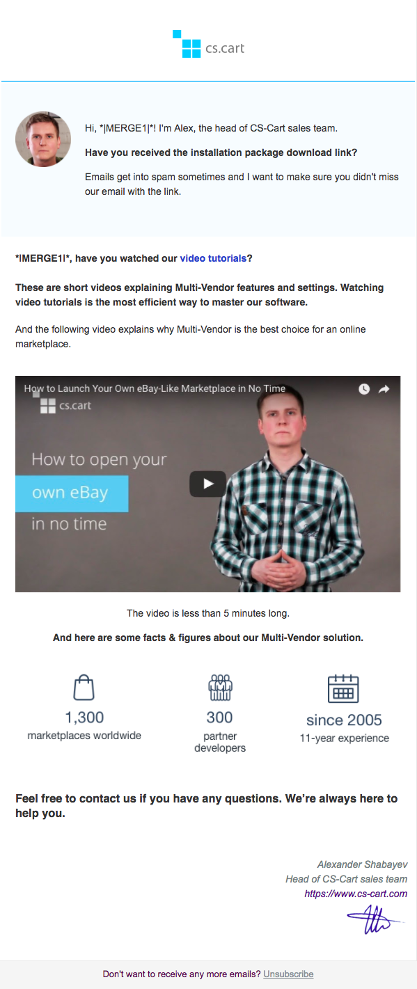
“We had quite an interesting experience with our email campaigns. We tried both: a fancy design and a plain text. Surprisingly, ordinary plain text emails sent to our customers performed 2 times better!
We have an autoresponder email chain, which is sent to each of our customers after he or she downloads the distribution package of our software. When we first launched this chain, all the emails in it were plain-text. Emails performed good—the open rate was 78%. Then we redesigned all the emails to make them look nice. The open rate quickly dropped to 42%. Then we re-made the emails again to plain text. The rate became 80% again.
Most of our customers have Gmail mailboxes. And Google is more likely to put fancy emails to the Promotions tab. And plain-text emails go straight to the Primary tab of Gmail. Consequently, that's why the open rate here is better.”
Here’s the graphically-designed HTML email that generated an open rate of 42%:
In contrast, here’s the plain text email that generated an 80% open rate:

Winner: Plain Text Email
In CS-Cart’s case, winning email marketing is all about getting past that Gmail promo filter. Even if your business is extremely visually-oriented, having an overly designed email template could bump you out of the "Primary" tab in Gmail. Infusionsoft backs this up “Clever email templates look great and businesses love them, but businesses end up in Promotions by default.”
App Institute Case Study: Getting More Personal With Email Marketing
 For online App builder, App Institute, the winner of the email design showdown has been clear.
Nabeena Mali, App Institute’s Head of Marketing, notes:
“For B2B emails - the simpler and more personalised the email, the better. We’ve tested both HTML emails with graphic content and plain text emails and the no-frills emails are always a winner. Plain text emails saw a reply rate of 34% compared to 4% when using more stylised, HTML content.”
Here’s the HTML email design with the 7% open rate and 4% reply rate:

Here’s the plain-text email design with an 18% open rate and 34% reply rate:
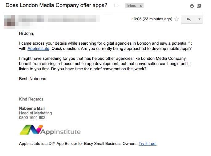
You’ll notice that the email copy and subject lines are different for these emails, which does factor into the open and reply rate.
“Of course, subject titles play the most important role, and we’ve found that being able to include the business name does the best in terms of open rate,” Nabeena continues. “When it comes to copy, keeping emails short, polite and to the point has always had the best response rate.”
This offers a very personal feel, and that's important when you're asking someone to give you their time. Stylised HTML emails have the downfall of coming across like a sales campaign, which people are less likely to respond to.”
Winner: Plain Text Email
Again, this B2B email marketing example, coming across as "sales-y" kills your chance at creating a dialogue between you and your prospects. With all the work that you put into acquiring that email, this missed opportunity is tough to swallow.
Firebrick Digital Case Study: Adding the Right Touch of Email Branding and Design
 Daniel Bamigboye, Digital Marketing Strategist at Firebrick Digital, has seen different results from his email marketing campaign testing:
“I have been running email campaigns for about two years now and all I can say from my experience is that the major difference between a graphically designed email and a plain text email is the open rate and click through rate of the emails.
Graphically designed emails just win especially when it comes to call-to-action click through rate. Open rate isn’t affected much because little is seen in email previews.”
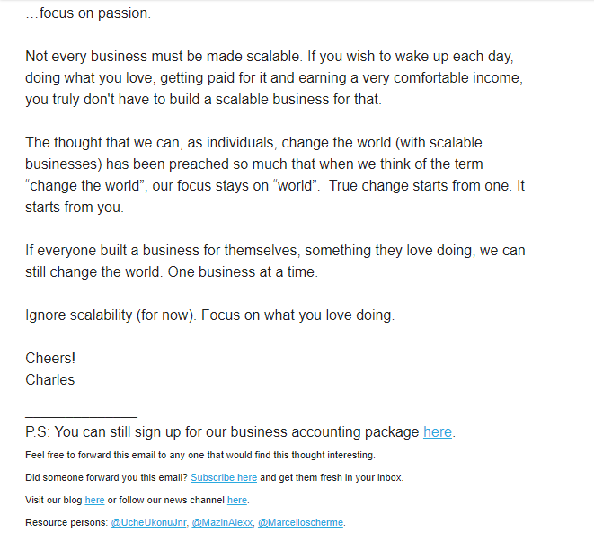
Here’s a typical plain-text email design which generated an open rate 16.625% and CTR of 1.45%:
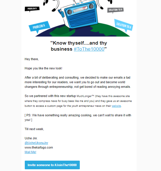
Here’s Firebrick's graphically designed HTML email, with an open rate 20.05% and CTR of 3.325 %:
Winner: Graphic Design Email
You'll notice that the HTML design in Firebrick's design is pretty minimal. Depending on the business and the offer, a bit of graphic-design to help branding can lead to improved performance in your email campaigns. A distinct call to action that matches what your audience wants and expects plays a big part in this.
Voodoo Marketing Case Study: Warming Up ‘Cold’ Prospects With Email Marketing
 Voodoo Video Marketing sends thousands of campaigns to millions of recipients on behalf or their corporate clients and their sales reps.
“We’re advocates of “plain text” emails,” CEO Robert Cassard explains, “and here’s why.
Our clients often test and measure the CTR of "plain text" emails vs. more heavily designed HTML graphic emails, usually under the following circumstances:
- Emails are sent from the addresses of individual sales reps, not central “generic” corporate email addresses
- Emails include a primary click-through link to watch a video — either a text link or a video thumbnail
CTR rates vary widely based on industry sector and whether the contact lists are “cold” or “warm.” In general, though, plain text emails generate significantly higher CTR than “prettier” HTML graphic emails."
A typical client campaign was recently sent to comparable “Cold” Prospect lists of a few hundred recipients. Both emails used the identical subject line and body copy. Here’s the graphically designed HTML email:

Here’s their plain-text email design:

The results are pretty stark. Despite 130 fewer recipients of Plain Text and a slightly lower open rate (8.4% vs. 10.3%) in that group, the plain text email nonetheless generated much higher CTR (32.2% vs. 4.7%) - yielding 4.75X the number of click-through video viewers compared to HTML design email.
This is typical of the results Robert's seen in most campaigns.
Winner: Plain Text Email
Why does plain text work here? Again, it looks like people in this campaign responded to the email design with a more personal feel.
"While I can’t conclusively explain why," Robert hypothesizes, "my own email opening/reading/responding patterns make it easy to guess."
"When I receive a “plain text" email (one that looks personally written and is addressed from a real person) it looks like all the other emails I receive from other real people. I’m more likely to look at it, read it, and respond to that real person’s request. In this case, they’re asking me to watch a video they think I’ll find helpful to my business. My likely response is either, “sure, I can give it a quick look” or a momentary a twinge of guilt for NOT responding as asked..."
With almost 5X the video viewers in a plain text email vs HTML design, simple email design is clearly worth testing.
Related Reading: How We Generated $42k ARR With a Simple Re-Engagement Campaign
Which Type of Email Design Wins?
In the examples above, 4 of the 5 businesses found that plain text email worked better for their campaigns. The primary factors cited were:
- That fancy graphic design came off as too "salesy"
- That simple plain text email delivered trust and authenticity
These case studies reflect current trends. As recently as August 2017, email marketing powerhouse Marketo found that plain text emails had a 17% higher unique click-through rate on offer links! (Anne Mitchell)
Another factor that looms over this email design debate is deliverability. Email filtering systems have evolved over the years to keep unwanted or dangerous emails from surfacing in our primary inbox:
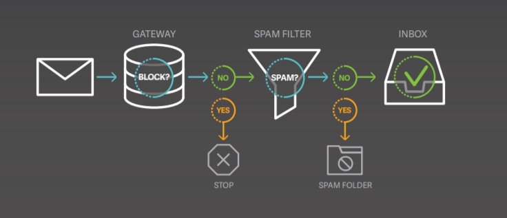
Using graphics may lead to better CTRs and may generate more leads in your industry...if potential clients ever see them.
"Of course," says Anne Mitchell, email law and policy lawyer and CEO of the email reputation and deliverability service SuretyMail, "if the email you send never makes it to the inbox due at least in part to (over)use of graphics and other code-based elements (HTML, cloaked links, video, etc.), then it doesn't matter how pretty your email is, because people aren't actually going to see it.”
Adds Mitchell, "Email spammers use graphics to get around content-based spam filters, so a high image-to-text ratio makes you look like a spammer."
Related Reading: Spam Laws: How to Comply and Keep Your Email Marketing Afloat
6 Key Tips to Design Emails that Convert
- Make it personal: We’ve seen from the above examples that the more personalized your email is, the more likely readers will engage with it. Even the salesy and generic emails that make it past the spam and Gmail "promo" tab don’t perform well. Why? They turn people off!
- Keep branding minimal: Adding a touch of branding is the best way we’ve found to communicate with our email audience. We want them to feel like they’re getting a personal email, just for them. But we still want them to sense that it falls under the Vendasta brand.
- Make sure email is optimized for mobile users: The majority of emails are now read on a mobile device. This means they need to be uncluttered, readable on any device, and be short and engaging. Long HTML emails with a ton of design don’t really work on the mobile medium.
- Add value: This may sound vague because it means something different for every business. For us at Vendasta, it means sharing quick tips and links to posts, guides, infographics, and webinars that share marketing tactics. For others, it could mean sharing stories, thoughts, stats, videos, pictures, or anything that your target audience would eat up!
- Have a clear CTA: What is the purpose of your email? Do you want people to reply, watch a video, answer a question, click a link, take a survey, or call you? Be clear about what you need from your readers, and have a plan to track your goals.
- A/B Split Test Your Emails: While the above examples highlight some of the results that marketers have had with different email design, doing your own testing is the best way to determine what'll work for you and your audience. The best way to proceed with design-testing would be to send separate plain text and HTML designed emails with the exact same copy. This way you'll be able to best determine the style that works best for your goals.
Related Reading: Humans Versus AI: Email Marketing Trends for 2018
Final Thoughts on Email Design
Despite the results we’ve shared from the 5 companies in this showdown, it’s impossible to say that there’s one surefire way that all companies should design emails.
You’ll still need to test different campaigns out and track the results you get for your clients and your business. Then go out and test some more! HTML email design could still really work for you, but you'll need to find out for yourself.
If you’d like some help with email marketing solutions for your clients, we can provide premade campaigns built specifically to target local businesses.
Or you can take a step back and download our most successful email marketing scripts for the top 10 email types!
[adrotate banner="77"]

