6 web design tips to build successful websites (with examples)
This guest post on web design tips is contributed by Ian Loew, web entrepreneur, inbound marketing expert, and the Owner & Head of Business Development of Lform Design.
Did you know a business could lose a large percentage of its customers if their website design is too complex and challenging to navigate? In fact, 38 percent of potential and existing customers will switch to another competitor brand instead of interacting with a poorly designed website. That stat makes web design tips critical for anyone building websites for clients.
Start diversifying your revenue stream. Get your “6-Step Guide to Selling Website Services to Local Businesses” now.
Most customers will not return to a website after their first lousy user experience, so before going live the first time around, set your clients up for website success.
Here are the top web design tips to keep in mind when designing a website:
- Easy navigation
- High-quality images
- Simple homepage design
- Social share and follow buttons
- Mobile-friendly design
- Scannable content
Let’s dive deeper into these web design tips.
1. Easy navigation
Navigation is one of the essential features of a responsive design. Technically, all the web pages you see today have a navigation bar, which typically includes menu items, a search bar, and probably a hamburger menu for mobile devices.
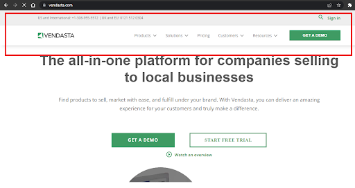
Visitors should be able to access the links to all top-level pages in one place. This will save them from the unnecessary hunt, which increases your website's bounce rate. Check out Vendasta’s homepage below and how the navigation bar is well-arranged to help visitors find the resource they need.
Consider using drop-down options for submenu lists, too.
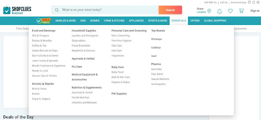
If you’re designing an e-commerce or entertainment website, you’ll have to deal with many subcategories or submenu lists. Create umbrella categories at the top, then place the subcategories under a drop-down menu, as shown below.
Scrolling right back to the beginning of a webpage can be a big hassle. Do your visitors a favor by adding the "Back To Top" action button. For mobile responsiveness, use a scalable icon, preferably an "arrow up" label, as shown by CSS-tricks below.

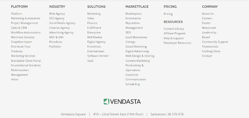
While drop-down menus are very useful in creating a responsive navbar, they can’t show all the links on your website without looking messy. So, use a mega footer to display additional links at the bottom:
The bottom line is that you should create easy navigation to enhance the user experience. This will boost sessions on the website. Additionally, it can increase sales since prospective customers will always find what they’re looking for.
2. Add high-quality images
Images can be used as an important element to engage customers or visitors without needing much textual content. They can also help improve your search rankings on search engines.
For example, Google has a search section that allows users to see image results. If website images are optimized with the right alt tags, they can appear in these results.
There are some things you need to keep in mind when adding images to a website:
Every section of a website reflects the owner's professionalism. Adding low-quality images to your website will do more harm than good. Blurry images hurt the user experience. That’s why you need high-resolution images.
Pro tip: Use JPEGs for effective image compression and fast loading.
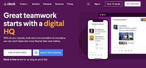
Another web design tip you must remember is that humans are more susceptible to visual illustrations than text. So avoid stock photos and use images that add value to the content. Your images should support the copy. That’s why the use of screenshots, illustrations, and videos are standard B2B web design practices.
The Slack homepage is an excellent example of this:
Be specific with the alt tags used for each image you add. As previously noted, this could help a website’s search engine optimization (SEO).
Using large images with excessive file sizes can affect a site's loading time. So a good web design tip is to compress and use lazy loads. In addition, some web hosting services can reduce your website's loading time by providing the necessary image optimization tools, thus contributing to a good mobile experience for your visitors.
3. Keep the homepage clutter free and simple
How visitors interact with a website depends on their first impression after landing on the homepage. Therefore, any homepage you design and pitch to clients must be neat. The menus need to be clear and clickable. Use white space sufficiently to ensure the important elements stand out. Add high-quality and engaging images to support the copy. Also, avoid huge chunks of text.
Freshbooks gets it nicely with this homepage.

Other web design tips to help you build a great homepage include:
-
Aesthetic elements are invaluable
The importance of adding visually appealing elements can not be overemphasized. While keeping your homepage simple, ensure you use high-quality images, vibrant colors, vertical art, and icons wherever necessary.
-
Personalize your homepage with awesome fonts
Use fonts that are simple yet engaging. Mixing sans-serif and serifs can disrupt the font consistency of your page and can make your content difficult to read.
Another thing to keep in mind is your font size. A font size of 16 pt is fairly apt, even for people with visual difficulties.
Also, avoid using more than three font types.
4. Include social share and follow buttons
Approximately 4.14 billion people use social media. That is more than half of the world's population. Therefore, it’s highly likely that a client’s target audience uses social media.
So include social share buttons to encourage existing website visitors to share the website content with others on social media. This web design tip is especially essential for e-commerce and marketing blogs.
Some of the most popularly used social media buttons are Twitter, Facebook, WhatsApp, and LinkedIn.
Place social and follow buttons in noticeable areas, like the top and left side of your page. Another strategic location is at the end of your blog posts or on a sticky bar.
Adding follow buttons for social media handles can also be placed in the footer section, like DocuSign below.

Be sure to describe the purpose of the social buttons. If the icons are for social sharing, point that out. If they are for following the brand’s social media accounts, mention that the site visitors can follow the brand on social. This is especially important if the icons are not in the footer.
5. Mobile-friendly pages
You might be surprised to hear that 61 percent of internet users will ditch a website that is not mobile friendly. This is crucial considering the shift to the use of mobile devices in accessing the internet. Therefore, designers must optimize web pages for mobile devices to retain visitors and deliver a great user experience.
Do these things to optimize a website for mobile use:
-
Use scalable hero image and aesthetic icons
Use a different hero image for your mobile content and limit the available functionalities while still maintaining relevance. Prioritize the use of scalable icons like a hamburger menu for drop-down navigation. A hamburger menu is a sandwich-like icon that opens a side menu or navigation bar when clicked.
-
Keep mobile content simple
Simplicity is still one of the most important web design tips to keep in mind. On the mobile page, keep things simple. Reduce the amount of information stacked on a single mobile page. Also, ensure all the information on the web pages, including images, can be viewed correctly through a mobile device.
-
Prioritize speed
Mobile-friendly pages shouldn't just look good and be scalable. They should load faster without a hitch. You can manually minify images and code to achieve a faster speed. Alternatively, you can use speed plugins for WordPress websites to improve the site speed. The beauty of optimizing a web page’s loading speeds is it’ll also benefit SEO. Google confirmed that site speed is a ranking factor because it affects the user experience.
6. Create scannable content
One of the top web design tips you need to know is to create scannable content. When someone visits your client’s website, it should take less than a few seconds to scan through the content on-screen. Most users will likely hit the exit button if it takes longer to scan through.
To prevent this, you need to implement a flexible visual hierarchy. Users should be able to locate the information they need and focus their energy on reading just that. Also, an excellent visual hierarchy should guide users from the most critical sections down the page.
Keep these web design tips in mind to create scannable content:
- Break content into bullet points or make use of headers (H1, H2, H3, H4, and H5)
- Use visual weight to feature essential sections. You can use a different background or text color to highlight an essential element from the rest.
- Include a call-to-action or more navigation options so that users are not left blank after reaching the end of the web page.
A good practice is to use a larger font size for hero text and gradually scale down to smaller sizes for the website's body.
Sell more websites with these web design tips
Users only need a few seconds to form an opinion about a website. When you sell websites to local businesses, your goal is to make sure that impression favors your client’s business. To achieve that, you need to follow several web design tips. We discussed six such tips in this article.
Ensure the websites you build for clients are easy to navigate, visually appealing, shareable, and mobile friendly. Importantly, the homepage and other landing pages should be simple and scannable to give visitors a good first impression.
Implement these web design tips to sell and create highly engaging websites your clients and their customers will love.
[adrotate banner="264"]

