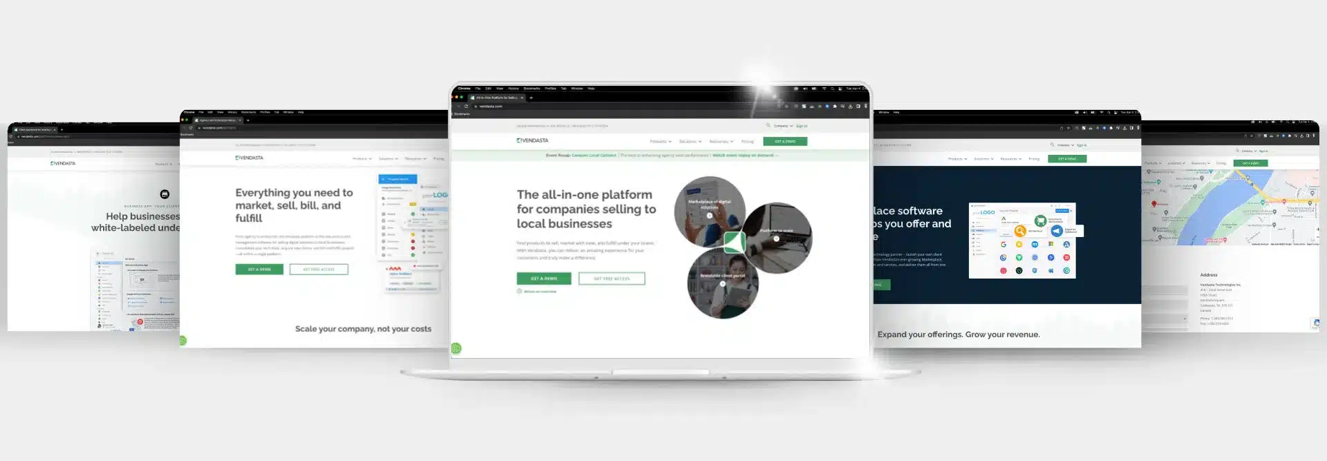
Online presence is no longer a luxury in the digital realm, as a website can make or break a small business. Regardless of whether your client offers a vital service, trendy products, or sweets and treats at a cozy café, they need a well-designed website to effectively communicate their business.
Web pages like an enticing homepage to draw in visitors, an about page to establish credibility, and product or service pages to showcase offerings are essential to a small business website. In this article, we’ll go through the importance of the types of web pages essential to a website one by one, providing key elements and examples to include in each.
Leverage a suite of web hosting tools to do the heavy lifting for you
Homepage
A business’s homepage has the power to captivate, engage, and convert casual visitors into loyal customers—if it’s designed and written well. Think of this page as the virtual curb appeal for a brand’s online presence. It’s the first impression that counts, and a well-crafted homepage leaves a lasting impact.
The homepage sets the tone for the entire website and communicates a brand’s essence to the visitor. The content within the homepage directs visitors to explore the site further and eventually, convert into a paying customer. With strategic design that includes compelling visuals, digital accessibility, concise messaging, and clear navigation, the homepage can be a powerful tool for showcasing a brand’s offerings and building trust with consumers.
What makes a successful homepage?
A good homepage combines several elements that quickly build a positive first impression with visitors. It’s important to note that 94% of web users base their first impression on a homepage’s design (WebFX), so make sure you’re building a home page that’s easy on the eyes and provides a positive user experience.
Other key elements that make a great home page include:
- A compelling headline: Use action words to grab attention and communicate the brand’s unique value proposition.
- High-quality images: Visuals are the best way to capture a visitor’s attention quickly but if they’re broken or low-quality, they can actually hurt your marketing efforts. In fact, 39% of people say they’ll leave a website that doesn’t have high-quality images (HubSpot).
- Persuasive copy: The copy on a homepage should be written with the purpose of enticing visitors to click through and explore other types of website pages.
- Call-to-action buttons: Buttons should be placed prominently throughout the homepage, inviting visitors to purchase, sign up, or continue exploring.
- Social proof: Add testimonials or user-generated content on the homepage to build credibility for the brand.
- Clear navigation: A menu and links throughout the page that direct users to other pages is vital for click-through rates.
Example: Colorsmith.co

Colorsmith’s homepage makes a good first impression with a high-quality hero banner that features concise copy and a clear call-to-action button. It also features a simple navigation menu and explains immediately what the company is about.
About page
The about page is where visitors learn everything they need to know about the brand. Small businesses have the opportunity here to share their story and establish a personal connection with website visitors. It also offers up the chance to showcase expertise through team member bios, build credibility by listing affiliations or awards, and share the brand’s purpose in its mission, vision, and values.
What makes a successful about page?
A successful about page humanizes the brand, helping visitors understand the people behind it and enticing them to convert into loyal customers.
Key elements of a great about page include:
- Brand story: Use this page to weave an inspiring narrative about the brand’s origins.
- Mission, vision, and values: This section should list three to five core values the brand holds, as well as its purpose and vision.
- Team members: Introduce key players in the organization, including founders, and use this space to showcase their expertise and experience.
- Awards and achievements: If the company has affiliations and memberships in industry organizations, if it’s been recognized with awards, or if it’s accredited by the Better Business Bureau or other organizations, be sure to list them here.
Example: Moz
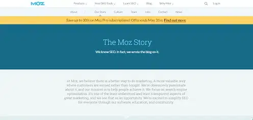
Moz’s about page goes right into the brand’s story, explaining where the company came from and what it’s all about in concise language.

The brand also does a great job of touching on its origins with a short paragraph that introduces the founder and the history of the business.
Service or product pages
Service and product pages are the bread and butter of a website. They help small businesses show off what they’re selling and act as virtual storefronts, providing visitors with detailed information about the products or services up for offer.
A service or product page is the type of web page that most effectively communicates value and showcases a brand’s competitive advantage.
What makes a successful service or product page?
The right service or product page design can help your client turn visitors into customers. Key elements to incorporate include:
- Clear titles and descriptions: Concise wording and compelling descriptions can make it easier for visitors to understand what your client offers and the benefits of those products or services. Include product specifications and detail of what a purchase includes.
- Images: Product pages should have clear, staged images showing the product for sale. Use several angles and close up images to ensure visitors understand what’s for sale.
- Price: If applicable, provide transparent pricing or package options directly on product or service pages.
Example: Orangina
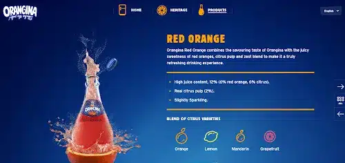
Orangina’s product page features great visuals and easy-to-read, scannable copy that entices the visitor to try the product. These pages also clearly outline what the product is and what it contains.
Testimonials and case studies
Testimonials and case studies help small businesses prove their worth. They build credibility and show off the typical results buyers can expect when they purchase a product or service from the company.
What makes a successful testimonial and case study page?
Whether you rely on testimonials, case studies, or a combination of both to market your client’s brand depends on the nature of their business. While retail and basic services typically don’t require elaborate case studies to add credibility, businesses that offer professional services, including those in the legal, construction, and marketing industries, can benefit vastly from posting case studies on their websites.
While a testimonial page is easy to design and can simply list testimonials along with client names, a case study page is more elaborate to create and should contain:
- Background: Outline the problem or challenge your client faced.
- Goals and objectives: What did their client expect the outcome to be when they hired the company to provide a service.
- The outcome: Provide qualitative and quantitative results of what happened after your client was hired for and completed a particular project.
Example: Ahrefs

Ahrefs keeps their customer testimonials page simple, featuring a short statement from a satisfied customer along with the customer’s photo, name, company, and position.
Contact page
The entire purpose of a website is to sell products or services and put consumers in touch with businesses. This type of web page ensures that site visitors know how to reach out to the brand if they have questions, complaints, or positive feedback.
What makes a successful contact page?
A contact page should be simple. Its key elements should include:
- A contact form: It should feature fields where the customer can enter their name, phone number, e-mail address, and questions or comments.
- Contact information: This should include the company’s official address and phone number, as well as important email addresses.
Example: PeopleMetrics
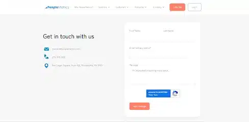
The PeopleMetrics contact page is simple and to the point. It gives customers the freedom to provide the feedback or ask the questions they want to or reach out to the business via other means.
Bonus: Blog page
A blog can be an essential type of web page, especially when it comes to link-building and search engine optimization. It also gives you the opportunity to build up authoritative content for your client on topics and keywords that are frequently searched within their industry.
What makes a successful blog?
A good blog post should feature optimized content on topics that are relevant to the brand; however, they shouldn’t contain sales copy. The best blogs are informative, interesting, and easy to read with plenty of short sections, scannable content like lists and images, and a brief call-to-action at the end that doesn’t feel over the top. Furthermore, blogs should be easy for readers to share and feature social media links and share buttons prominently.
The main page should feature the most recent blogs near the top, each listed with an appropriate image, a captivating headline, and a short blurb enticing visitors to read further.
Example: Design Milk
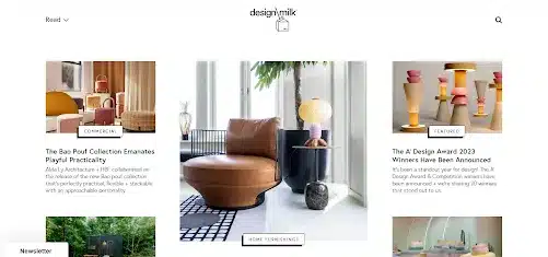
The Design Milk blog page features plenty of white space, making it easy to view featured blogs without excess background noise. It also offers up interesting titles and headlines to draw readers in.
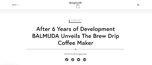
Design Milk’s blog posts also feature a clean header with the title, publication date, author name, and social media share links.
Types of Web Pages FAQs
1. How many core web pages does a small business website actually need?
Most small business websites only need six foundational pages: homepage, about, services or products, testimonials, contact, and a blog. These create clarity, trust, and strong navigation without overwhelming visitors.
2. Why is the homepage the most important page on a small business website?
The homepage forms the first impression and guides visitors to the rest of the site. Strong visuals, a clear value proposition, and obvious next steps help convert casual visitors into engaged prospects.
3. What makes an about page effective for small business websites?
A great about page builds credibility by sharing the brand story, mission, values, and team. It helps visitors feel connected to the business, increasing trust and conversion likelihood.
4. How should small businesses structure their product or service pages?
Each page should have clear titles, benefit-focused descriptions, pricing, strong images, and scannable sections. These help visitors understand the offer quickly and reduce friction in the buying journey.
5. Why are testimonials and case studies essential for small business websites?
They provide proof that the business delivers results. Testimonials build confidence, while case studies demonstrate expertise through real outcomes—especially useful for service-based industries.
6. What elements should a contact page always include?
Every contact page needs a simple form, a phone number, an email address, the physical location if applicable, and alternate contact options. This ensures visitors can get in touch with minimal effort.
7. Should small businesses include a blog on their website?
A blog strengthens SEO, builds authority, and attracts organic traffic. It also gives the business a platform to educate, answer common questions, and share updates that deepen audience engagement.
8. How can small businesses keep their website navigation simple and effective?
Limit the number of top-level menu items, use clear labels, group related pages, and ensure each page leads naturally to the next. Clean navigation improves user experience and keeps visitors browsing.
9. Do all website pages need a CTA?
Yes—every page should guide visitors toward an action. Whether it’s reading more, contacting the business, signing up, or making a purchase, each CTA keeps users moving with intention.
10. How often should small business websites update their core pages?
Review core pages at least twice a year. Update product details, imagery, testimonials, and blog content to ensure accuracy, freshness, and continued SEO growth.

